
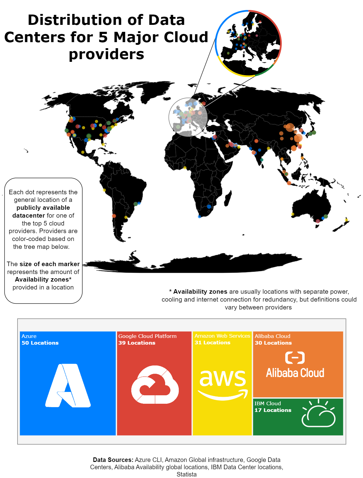
Visualizing the distribution of datacenters for 5 major cloud providers
Everybody knows that cloud hyperscalers operate a small army worth of datacenters across various regions, countries, and continents. But having just received my AZ-900 Azure Fundamentals certification at the time I wanted a better way to visualize where these datacenters are physically located.
Having recently also started working with plotly to create graphs, I saw this as a brilliant opportunity to get some experience using the library while also furthering my cloud skills. In this blog I will walk you through the experience making this visualization along with some of the thought processes that were involved and the context I could not fit anywhere else.
The workflow
Tools
The primary tools I used for this project are:
- Python
- Pandas for handling tabular data
- Plotly for visualization
- GeoPy for Geocoding
- Draw.io for visualizing
Out of all these choices, the only one I was really disappointed with was Draw.io which, frankly, I don’t think I was using right. Draw.io provides a powerful suite of tools for creating vector graphics – that is, graphics that will not get lose quality when sized up or down – in the form of SVG files. Since plotly also allowed for the export of SVGs I thought it would be perfect for taking the SVG files from plotly, decorating them with the static graphics, then exporting them as a SVG file and resizing the file to the size I wanted. In this case however, I think too much editing was done on my part which dragged down performance and slowed down my work.
While Draw.io is still an amazing choice for creating flowcharts, I think that I will try using an alternative such as Canva or Inkscape next time and leave draw.io for the next time I need to create a quick and easy drawing or flowchart.
File structure
I found for this project, and many projects in the past, that working with a strict file structure made work much easier, in this case mine followed this structure:
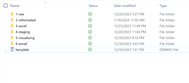
This made it easy to track where data was in the workflow and add more data if the need arose. For example halfway through making my Azure data I realized that some of the datacenters listed in azure were duplicates, so it was simple enough to go back into the “2-reformated” file, update the python script to remove the duplicates, then run all the python scripts until I got back to the place I was working in.
The acknowledgements
This is my first major visualization work, and as such there are many, many mistakes in this graphic.
Some of them are merely visual, for example some of the dots overlap or cancel each other out and can be too small or large in places.
But the mistakes I am mainly concerned about are the fundamental mistakes in the data. Firstly, while azure and google were able to provide helpful command line utilities to get the information of all their datacenters, most of the other companies did not and a large portion of the data gathered for this table was manually scrapped from websites. This means that company policy influences how they appear in this graphic. A company like IBM may have 3 availability zones in Singapore, but their definition of availability zones might be different from a Microsoft availability zone in the middle of Texas where each availability zone has a connection to a separate grid. This is particularly evident in Alibaba where the company can have up to 12 availability zones in and around Beijing, something not possible for a company like google where availability zones each need different connections to different grids.
Another instance of this is location, Microsoft provided coordinates for each datacenter, but upon further inspection these turned out to simply be the coordinates of the nearest towns. No other companies provided this much information. The most I was able to get out of most of these were the locations of the nearest town which I had to use a geocoder to extract the location of. Since geocoders are not always accurate however this resulted in some datacenters being positioned in the middle of the ocean and other inconvenient place, as such a lot of this data was tweaked manually to produce the result in the closest Approximate area near the location given, and the fact that the points are so big on the map should mean people get a good enough idea to form a solid understanding of where the major datacenters as they are.
While I gave my reasons for both these shortcomings, it is important to acknowledge them for what they are, shortcomings and opportunities to grow for next time. The data might not have been the most unbiased or exceptionally accurate, but it was accurate enough to give readers a good idea of what I was showing, and next time I will take more time to research a topic before hand before I take random HTML tables from a company website and run with them.
The end
All in all, this was a very fun project to work on that taught me a lot about python, map projections, datacenters, visualizations, geocoding, and loads of other fun stuff.
I very much look forward to starting work on my next visualization and I hope you enjoyed hearing about this one, for further details or requests contact me at alexmgullen@gmail.com